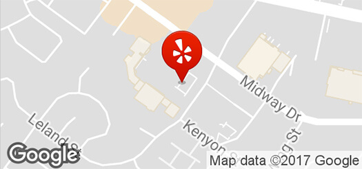
3625 Midway Dr, Ste B
San Diego, CA 92110
Directions
(619) 226-1600
classicsmaltshop.com

3625 Midway Dr, Ste B
San Diego, CA 92110
Directions
(619) 226-1600
classicsmaltshop.com
Yelp's above the fold experience: messy and cluttered. The color overload and contrast issues, therein are a major factor behind this, along with too many options for a user to click on.
What's screaming for the user's attention?
Everything in this high-priority red (#d32323).
Between the colors, navigation, ads, and more, it's all just a bit...well, Vegas.
After digesting this original landing page's content hierarchy, layout, and structure, I decided that more than 50% of the content and navigation links, above the fold, needed to go. There's simply too much going on, and with no clear intent.
Though I like using Sketch, Balsamiq, PS, and more, I took to paper for this exercises's wireframes.
I'm calling this version the "anti-fold", with it's big, bold hero space and minimal design, yet with just the right amount, exactly what's needed, above the fold.
Visually, it's obvious that there's more content to see if a scrolling action is taken. I mindfully contained the hero section's height and added a negative margin on the second section's content, moving it up into the hero container.
This version will get users leaving reviews. The intent is clear, the call to action of "Leave your review" is more personal and actionable, and users are not overloaded with a plethora of options, links, and places to click.
Yelp's main, red color has been used sparingly here, reserving it just for the main/primary call to action, anchor links, and star icons.
I designed this with both primary and secondary call to action buttons. Risky move, right?
In defense of this decision: the actions of either direction here will essentially lead toward the same goal: user submissions, reviews (assuming they're prompted to add a review, when submitting a photo). Nonetheless, "Leave your review" is still the main call to action.
The above the fold options of where a user may click: review, submit photo, sign up, log in, search (a less obvious, intrusive search), and again (for emphasis) another "Write review" link. Three of the six clickable actions lend to users submitting content, reviews.
Read and see more in the README.